How to Develop a Sign up and Sign in Page using React by Replicating LinkedIn's Sign Up Page


Introduction
Retaining users can be a challenge, but one effective method is to ensure a smooth and hassle-free sign-up and sign-in process. In line with this, we will be creating a sign-up page that emulates LinkedIn's process.
This tutorial will guide you through the process of building a React form and handling form submissions with a user sign-up example. By the end of this course, you will have the skills to create a form for any use case.
Prerequisites
Visual studio code
Understanding of Javascript
Understanding of React Hook, Jsx
Setting up React
To begin, you must set up your React application by using either Create React or Vite.
After the installation process is complete, open your terminal and install Sass, which will be used to style the project. Additionally, install React Icons for our icons.
npm install sass
npm install react-icons
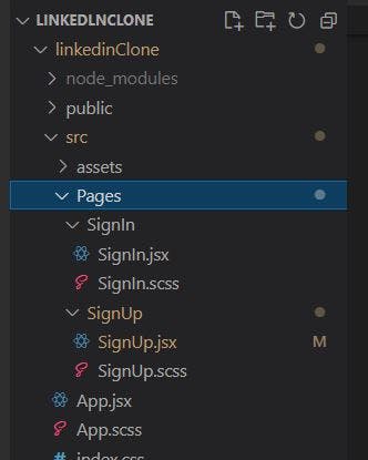
Creating the Form Component
To begin creating the components for SignIn and SignOut, follow these steps:
In your
srcfolder, create a new folder and name itpages.Inside the
pagesfolder, create a new folder and name itSignOut.In the
SignOutfolder, create two new files namedSignOut.jsxandSignOut.scss.Repeat the same process for
SignInby creating a folder namedSignIn.In the
SignInfolder, create two new files namedSignIn.jsxandSignIn.scss
Creating the form layout
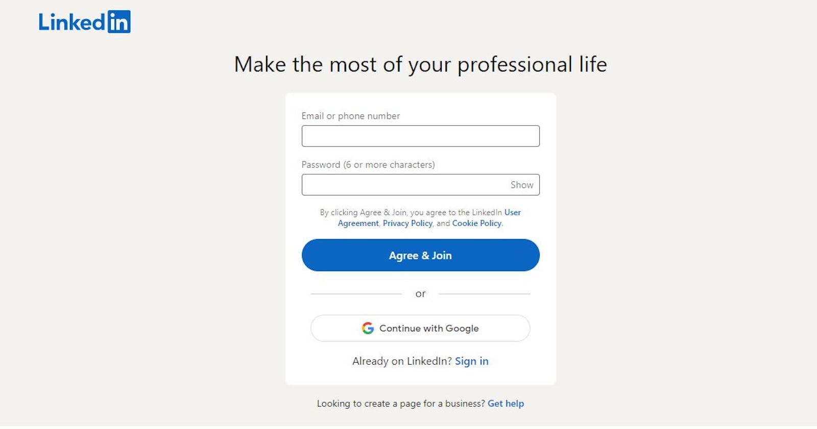
To create the layout for our LinkedIn Clone SignUp page, follow these steps:
Navigate to
signup.jsx.Create a logo by importing and rendering the appropriate image, you can find the logo svg in the project github repository.
Create a header by adding a
h1tag with the text "Make the most of your professional Life".Create a form component by adding a
formtag.Inside the
formtag, addinputfields for the email and password.Add a
submitbutton to the form.
Here is an example of what the code may look like:
import React, { useState } from 'react'
import Logo from '../../assets/LinkedInLogo.svg'
import './SignUp.scss'
import {FcGoogle} from "react-icons/fc"


const SignUp = () => {
  return (
    <section className='signup'>
      {/* logo div */}
      <div className='logoDiv'>
        <img src={Logo} className="logo" alt="logo" />
      </div>

      {/* Page Title */}
      <h1>Make the most of your professional Life</h1>

      {/* Form section */}
      <div className='form-col'>
        <form>
          {/* label and input for Email */}
          <label>Email or Phone number</label>
          <input
            type='email'
            id='email'
            value = {email}
          />

          {/* label and input for password */}
          <label>Password</label>
          <input
            type='password'
            id='password'
            value = {password}
          />

          <p className='p-text'>By clicking Agree & Join, you agree to the LinkedIn <span>User Agreement, Privacy Policy</span>, and <span>Cookie Policy</span></p>

          {/* SignUp Button */}
          <button className='agreeBtn' type='submit'>
            Agree & Join
          </button>

          <p className='or'>or</p>

          {/* SignUp with Google button */}
          <button type='submit' className='googleBtn'>
            <FcGoogle className='googleFont'/>
            Continue with Google
          </button>

        </form>

        <h6>Already on LinkedIn? <span>Sign in</span> </h6>
      </div>

      <p className='p-help'>Looking to create a page for a business? <span>Get help</span></p>
    </section>
  )
}

export default SignUp
To style the layout of our page, follow these steps:
Navigate to
style.scss.Style the logo by setting a
max-widthandheight, as well asmargin-topandmargin-bottomproperties to center it on the page.Style the
h1tag to set the font size and color.Style the
formtag to add a background color, set a border radius, and center it on the page.Style the
inputfields to add a border, padding, and margin.Style the
submitbutton by adding a background color, setting the font color, and adding padding and margin.
Here is an example of what the code may look like:
.signup{
    background-color: whitesmoke;
    height: 100vh;

    .logoDiv{
        max-width: 200px;
        padding: 1.5rem 0 0 3rem;
    }
    img{
        height: 70px;
        width: 200px;
    }

    span{
        color: #0a66c2;
    }

    h1{
        font-size: 2.5rem;
        text-align: center;
        font-weight: 500;
        margin-top: 2rem;
        margin-bottom: 1.2rem;
    }

    p{
        text-align: center;
    }

    @media screen and (max-width:1200px) {
        .logoDiv{
            padding: 0;
        }
    }

    // for screen lesser than 1200px
    @media screen and (max-width:1200px) {
        .logoDiv{
            padding: 0;
            max-width: 100px;
        }
        img{
            height: 50px;
            width: 130px;
        }

        h1{
            font-size: 1.5rem;
        }
    }
}

.form-col{
    max-width: 70%;
    margin: 0 auto;

    h6{
        font-size: 1.2rem;
        font-weight: lighter;
        text-align: center;
        margin-bottom: 4rem;
        color: rgba(0,0,0,0.7);

    }

    form{
        display: flex;
        flex-direction: column;
        label{
            font-size: 1rem;
            font-weight: light;
            color: gray;
            margin-bottom: 10px;
        }
        input{
            padding: 0.6rem 0;
            margin-bottom: 15px;
            border-radius: 5px;
        }

        .p-text{
            font-size: 0.9rem;
            font-weight: lighter;
            color: rgba(0,0,0,0.6);
            margin-top: 0.5rem;

        }
        span{
            font-size: 0.8rem;
        }

        .agreeBtn{
            padding: 1rem 1rem;
            background-color: #0a66c2;
            font-size: medium;
            font-weight: 500;
            color: white;
            border-radius: 30px;

            border: none;
            cursor: pointer;
        }

        .or{
            display: none;
        }

        .googleBtn{
            padding: 1rem 5rem;
            background-color: #ffffff;
            font-size: medium;
            font-weight: 500;
            color: #000;
            border-radius: 30px;
            // margin: 1rem 2rem;
            border: 1px solid gray;
            cursor: pointer;
            // max-width: 400px;
            margin: 1rem auto;
            display: flex;
            justify-content: center;
            align-items: center;

            .googleFont{
                font-size: 1.4rem;
                margin-right: 0.3rem;
            }
        }

    }

    // for screen greater than 1200px
    @media screen and (min-width:1200px) {
        border: 1px solid white;
        background-color: white;
        width: 40%;
        max-width: 450px;
        margin: 0 auto 20px;
        padding: 20px;
        box-shadow: 0px 10px 15px -3px rgba(0,0,0,0.1);
        border-radius: 10px;

        h6{
            margin-bottom: 1rem;
        }

        form{
            .or{
                padding:0 15px;
                text-align: center;
                font-size: 0.9rem;
                font-weight: 200;
                color: rgba(0,0,0,0.6);
                // margin-top: 20px;
                display: block;

            }
            .agreeBtn{
                margin: 1rem 0;
            }
        }


    }

    // for screen less than 800px
    @media screen and (max-width: 800px) {
        max-width: 90%;

        form{
            .p-text{
                display: none;
            }
        }
    }
}
Collecting Form Data
We need to collect the data that the user enters in the form. To do this, we can use the useState hook to create a state object called formData with keys for email and password. Each key is initialized with an empty string, and will be updated as the user enters data into each input field.
Here are the steps to collect form data:
Import the
useStatehook at the top of your component file.In your component function, create a state object called
formDatawith keys for email and password, and initialize each key with an empty string.Use destructuring assignment to create two variables,
emailandpassword, that are assigned the values of their respective keys in theformDataobject.Add a
valueattribute to each input field in your JSX, and set its value to the corresponding key in theformDataobject.Add an
onChangeevent handler to each input field that calls a function to update theformDataobject with the new value entered by the user. You can use thesetFormDatafunction that was returned by theuseStatehook to update the state object.Add an onSubmit The function
onSubmit(e)is used to handle the submission of our form. When the form is submitted, this function is triggered.
const SignUp = () => {
  const [formData, setFormData] = useState({
    email: "",
    password: ""
  })

  const {email, password} = formData

  function onChange(e) {
    console.log(e.target.value)
    setFormData((prevState) => ({
      ...prevState,
      [e.target.id]:e.target.value,
    }))
  }


  return (
    <section className='signup'>
      <div className='logoDiv'>
        <img src={Logo} className="logo" alt="logo" />
      </div>

      <h1>Make the most of your professional Life</h1>
      <div className='form-col'>
        <form onSubmit={onSubmit}>
          <label>Email or Phone number</label>
          <input
            type='email'
            id='email'
            value={email}
            onChange={onChange}

          />

          <label>Email or Phone number</label>
          <input
            type='password'
            id='password'
            value={password}
            onChange={onChange}
          />

          <p className='p-text'>By clicking Agree & Join, you agree to the LinkedIn <span>User Agreement, Privacy Policy</span>, and <span>Cookie Policy</span></p>

          <button
            className='agreeBtn'
            type='submit'

          >
            Agree & Join
          </button>

          <p className='or'>or</p>

          <button
            type='submit'
            className='googleBtn'

          >
            <FcGoogle
              className='googleFont'
            />
            Continue with Google
          </button>

        </form>

        <h6>Already on LinkedIn? <span>Sign in</span> </h6>
      </div>

      <p className='p-help'>Looking to create a page for a business? <span>Get help</span></p>
    </section>
  )
}
Handling Input Change
The onChange function will be called whenever the user types something in any input field
  function onChange(e) {
    console.log(e.target.value)
    setFormData((prevState) => ({
      ...prevState,
      [e.target.id]:e.target.value,
    }))
  }
This function onChange(e) is used to update the form data object (formData) as the user interacts with the input fields. When an input field is changed, this function is triggered and logs the current value of the input field to the console.
The setFormData function is then used to update the formData object with the new value of the input field. The prevState parameter refers to the previous value of the formData object before it is updated. The [e.target.id] syntax is used to dynamically set the key in the formData object based on the id property of the input field that triggered the event. This way, the function can update the corresponding key in the formData object with the new value of the input field using e.target.value.
Handling Form Submission
To handle the submission of the form, you need to add an event handler to the <form> element. This event handler is called when the form is submitted.
  function onSubmit(e){
    e.preventDefault()
    alert("success")
    console.log(formData)
  }
The function onSubmit(e) is used to handle the submission of our form. When the form is submitted, this function is triggered.
The e.preventDefault() statement prevents the default behavior of the form, which is to refresh the page upon submission. This way, we can control what happens after the form is submitted.
In this code, the alert("success") statement is used to display a success message to the user upon successful submission. This can be useful for providing feedback to the user that the form has been submitted successfully.
Finally, the console.log(formData) statement is used to log the form data object (formData) to the console upon submission. This can be helpful for debugging and testing the form.
Hide/Show Password functionality
In this step, we will implement a feature to allow the user to toggle the visibility of the password field, which can either be shown or hidden.
  const [showPassword, setShowPassword] = useState(false)

  function passwordState(){
    setShowPassword(prevState => !prevState)
  }
The const [showPassword, setShowPassword] = useState(false) line declares a new state variable called showPassword. The initial value of this variable is set to false using the useState hook.
The function passwordState() function is called when the user clicks on a button or checkbox to toggle the visibility of the password field. When this function is called, it uses the setShowPassword function to update the showPassword variable.
setShowPassword(prevState => !prevState) is a shorthand syntax for updating the showPassword variable to the opposite of its current value. In other words, if showPassword is currently false, it will be updated to true, and if it's currently true, it will be updated to false.
So when the user clicks on the button or checkbox, passwordState() is called, and it updates the showPassword variable. This in turn updates the visibility of the password field - if showPassword is true, the password field will be visible, and if it's false, the password field will be hidden.
In the input tag for password we add a conditional statement that renders either a "Show" or "Hide" button based on the current value of the showPassword state variable.
          <div className='password'>
            <input
              type={showPassword ? "text" : "password"}
              id='password'
              value={password}
              onChange={onChange}
            />
            {showPassword ?
              <p className='hide' onClick={passwordState}>Hide</p>
              :
              <p className='hide' onClick={passwordState}>Show</p>
            }
          </div>
When the showPassword variable is true, the code renders a "Hide" button. This is indicated by the <p className='hide' onClick={passwordState}>Hide</p> line, which creates a new paragraph element (<p>) with the CSS class hide. This class could be used to style the button in a particular way. The onClick attribute specifies that the passwordState() function should be called when the user clicks on the button.
On the other hand, when the showPassword variable is false, the code renders a "Show" button. This is indicated by the <p className='hide' onClick={passwordState}>Show</p> line, which creates a new paragraph element with the same CSS class and onClick attribute as before, but with the text "Show" instead of "Hide".
Conclusion
We have successfully built a sign-up page for a LinkedIn clone. We started by creating the basic layout of the page, added form fields for users to input their data, and implemented a form submission function. We also added a feature to show and hide the password field for user privacy.
This tutorial is just a starting point, and there are many more features and functionalities that could be added to make it even more robust. I encourage you to continue exploring and expanding on what you’ve learned here.
You can find the complete source code for this project on my GitHub repository here. Thank you for following along!
I'd love to connect with you via Twitter | LinkedIn | GitHub |